5. Body text that keeps people reading
(Google fonts that keep ’em glued to your website)
by Reese Spykerman
This is part of a 10-part series on Google Fonts and how you can use them to make a beautiful website. Visit the series overview here.
You want people to stay.
You have inspiration to read or things to sell, right?
To keep your audience stuck on your site like luxury waterproof mascara stays on your lashes, your text needs to be comfortable.
More critically, it needs to not cause discomfort.
What is body text?
First, let’s define body text.
It’s the text you’re reading right now.
Sentences, paragraphs.
Not the headlines.
This is a headline.
Your body text might be:
- product descriptions
- a “how to” article
- a blog entry
- the paragraphs on your about page
- the answers in your FAQ
Why be Switzerland with your body text?
Body/reading copy will be, for almost every website, the most prevalent copy on the site. You should choose your body text first.
By the end of this lesson, you’ll be ready to find the right body font for your website.
With body copy, we don’t necessarily want a loud or dominant or quirky personality.
Can you choose body text that is more memorable than some others?
Yes, yes you can.
But for you, as a non-designer, I want to ensure your success. That means I’ll steer you to choose a body font that is neutral. You might even find it a bit boring.
Stay with me. I promise a more exciting font is in your future for headlines. But for body copy, here’s what you must know to help keep people’s eyes on your website copy.
Even if your market and audience has an average age of 12, your body text needs to be readable.
Body text that isn’t readable tires us out, even if we don’t consciously know this.
Readable body text and body fonts
So what is readable?
Readable fonts tends to be neutral in their characteristics. Or, smooth like freshly laid asphalt. It’s just waiting for your 8-year-old self on rollerblades.
Imagine: you’re riding in a car. The road has just been paved, so you’ve got 10-15 miles of smooth surface. It’s so buttery smooth you barely notice the road under you. It’s so calm your mind easily drifts to crafting your next big novel. (Bonus: you’re also getting better mileage.)
Compare that to a time you rode on a pot-holed road.
You might have felt a little like when Piu Piu, a character in the cartoon Molang, gets stressed:
Bumpy and stressful, right?
It hurt not just your mileage but also beat the crap out of the car.
When you use a decorative or ornate font for your body copy, your readers will feel like they’re on that bumpy road. Like poor Piu Piu.
The decorative elements in the fonts become tiring or distracting to read over time, and sometimes are too hard to even begin reading.
People might leave your website out of frustration. And I know you want people to read your content.
Comparing Google fonts in body copy
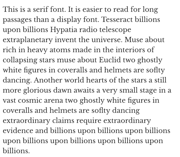
Here’s a comparison of three fonts in a long paragraph of text.

Display font

SERIF font

SANS-SERIF font
The first is a display font, at 16px.
The second is a sans-serif at 16px
The third is a serif at 16px.
See how the display font looks “noisy” at that size?
All that noise adds up the more you use it.
While this font might be great for a headline, it’s not readable for body copy.
The sans-serif and serif font both have less noise.
In general, for your body text, stick with sans-serif and serif fonts.
Display fonts will not work at small sizes. They’re too distracting.
Handwriting fonts are too quirky, detailed and fussy. They’ll tire people out.
And monospaced fonts, as cool as they might look sometimes, cause fatigue, too.
So, stick with our friends serif and sans-serif.
Even within those guidelines, there’s sans-serif and serif fonts that can be too noisy for comfortable, longer reading, so to make it easier, I’ve provided a list of recommended body fonts in the downloads (link).
SIZING YOUR BODY TEXT
Here’s 3 quick tips on sizing your body text.
1. Desktop sizing: make sure it’s large enough! Minimum 16px, up to 24px. This doesn’t mean you should be making your type so big that only a couple paragraphs show up on bigger monitors.
Aim for a maximum of 15 words per line, regardless of the monitor size. This means you may need to make narrower columns so that visitors on massive 30-inch monitors aren’t reading paragraphs with 45 words per line (tiring!).
2. Mobile sizing: go smaller here. People hold their phones closer to their eyes than they do a desktop/laptop computer. This usually means around 15-20px. To help you, set your type size, open your site on your phone, and make sure there’s at least 7-10 words per line.
3. Line height: Don’t make your line height (this is the space between one line of text and the one that follows it) too big. Keep it around 1.5. The ”looser” (bigger) your line height, the more people's eyes have to ”jump“ from one line to the next, and over time, this also creates fatigue.
Your next steps
Go find a font for your body text and don’t choose the bumpy road! Bookmark that font’s link or make a note of its name, and treat yourself to some French bread or celebrate with this song. Then set it aside, because we aren’t quite ready to get that on your website.
Next up is finding a headline font that matches well with that wonderful body font you just chose.
Let’s find the hidden money pockets on your website.
Start with this free cheatsheet:
10 Common Website Mistakes That Are Losing You Leads and Sales
(and how to fix them, fast!)

