2. Making Sense of Google Font Categories
Like your family at the holidays
by Reese Spykerman
This is part of a 10-part series on Google Fonts and how you can use them to make a beautiful website. Visit the series overview here.
Remember The Breakfast Club?
You had the jock, the rich girl. The geek, the bad boy, and the outcast.
They each had different traits, right?
Google Font categories are kind of like that, without the teenaged hormones and leg warmers.
Google categorizes its fonts into 5 different groups:
- Serif
- Sans Serif
- Display
- Handwriting
- Monospace
There’s differences among all of them. Let’s look at the first two and compare and contrast them.
1. Serif and
2. sans serif Google fonts
Here’s an image with the word “hi.” On the left is a sans-serif font, and on the right is a sans-serif font.

In this next image, look at the circles on the serif font.

See how the ends of this font have a bit of an embellishment or decoration? These are the serifs. Sometimes I refer to them as little feet. See how the serif font has these little feet, but the sans-serif font doesn’t?
Here’s another example with the word hi again, and I’ve shown two new fonts I’m sure you know (Times New Roman on the left, Arial on the right). Again the left is a serif, and the right is a sans serif.
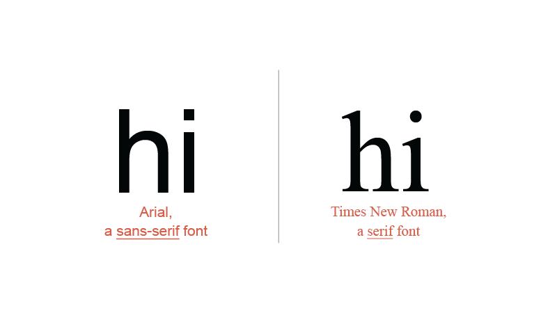
See the pattern?
In general, serif fonts tend to look a bit more:
- traditional
- Formal
- refined
Sans-serif fonts look a bit more:
- modern
- sophisticated
- approachable
This isn’t a hard and fast rule, but use it to help guide you at the 30,000-foot level when you do your initial sorting and font finding.
I’ve focused first on serif and sans-serif fonts because these two categories are I suggest you spend time when it comes to finding a body font — remember that’s the one for longer reading.
3. Google Display fonts
Display fonts work best for your headlines—they’re best for you to use at 30 pixels or higher.
Many of these fonts will be tough to read at smaller sizes, especially for your body font.
Here’s an example of a display headline at 16 pixels compared a serif, and a sans-serif font at the same size.
The problem with display fonts at small sizes

Display font

Serif font

Sans-serif font
See how the display font looks noisy and is challenging to read in longer text compared to the serif and sans-serif examples?
If you want a font with features that will work well in your headlines, choose display as a category when you’re hunting.
In case you’re wondering, this doesn’t mean that the other categories won’t work for your headlines or don’t look good at large sizes. Think about display more as something you probably want to stay away from for your body text…but has potential for your headlines.
4. Google Handwriting fonts
This one is probably obvious to you. These are fonts that look like someone’s handwriting. Some of them look like fancy scripts.
I’ve noticed some sites that use these fonts and unless they're used carefully, they can make your website look amateur or too frivolous.
If you’re styling the website for a pre-school, a handwriting font could be bang on.
I’ve also seen them used well in “snippets” on sites--as a form of decoration that helps give a conversational feel here and there.
The copywriting course The Copy Cure used a handwriting font extremely effectively as a small accent font in part of their 2019 sales page design. (The content in red with “been there” and “yup.”) It helped give a conversational tone to the page.
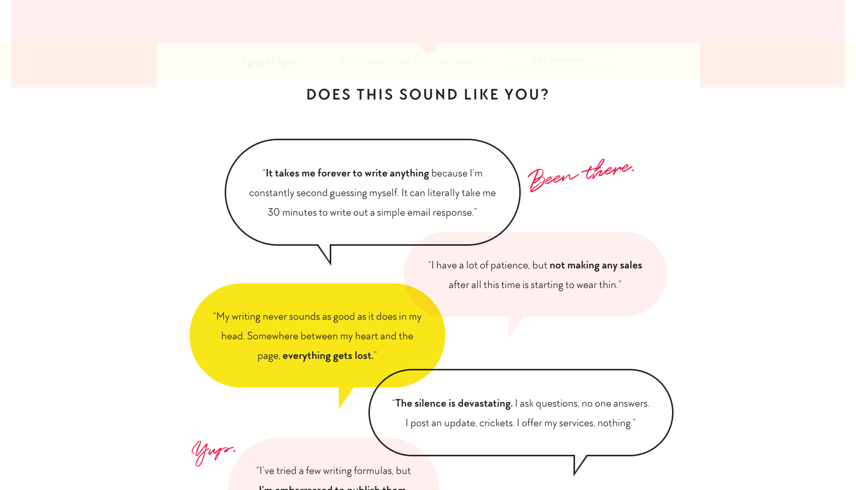
If you’re drawn to this category, but it’s important your website look trustworthy and professional, consider using it like The Copy Cure website: just a little accent here and there to add some interest and personality.
5. Google Monospace Fonts
Finally we’ve got monospace. I'm not here to boss you around, but… proceed carefully with these guys.
It doesn’t mean they don’t have merit in some designs, but they can be tricky to use appropriately.
Monospace fonts are relatives of typewriters. If you’ve ever seen how text on a typewriter looks, you’ll see many of these fonts look similar. Every letter is the same width, and that’s why they have the name monospace.
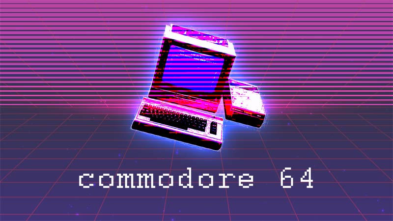
Some of them also look a bit like the fonts from older computers—like mid-80s old.
These fonts can be tough to read on the web, so if you’re going to use one, try them either on your headlines, or as small accent text.
The Tangent Cafe is a website that uses monospace well.
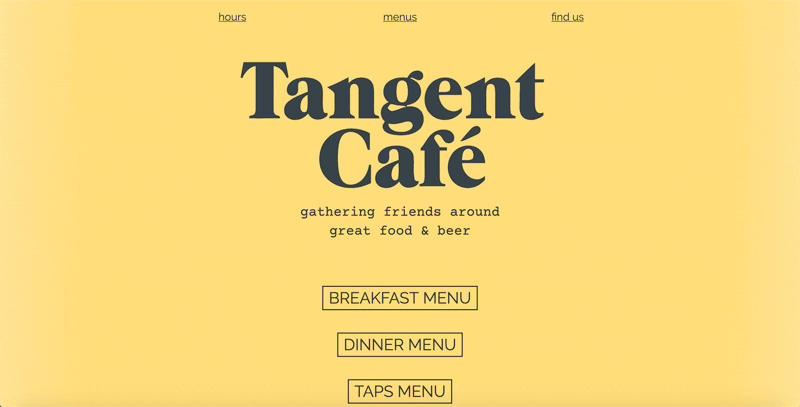
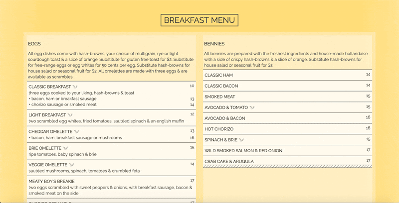
“Gathering friends around food and beer” is the monospace font. They use this font sparingly and if you open one of their menus, you can see they aren’t using courier for that.
Sorting through Google font categories might feel overwhelming. You might get caught in analysis paralysis, but it’s really not as hard as it may seem.
Your next steps
Choose one category at fonts.google.com to explore for 10 minutes.
Just set your filter to that one category and get a feel for how the fonts in there look and feel.
Then choose a different category and set the filter for just that category.
What differences do you notice?
Are you drawn to one broad category over another? Make note of it!
Let’s find the hidden money pockets on your website.
Start with this free cheatsheet:
10 Common Website Mistakes That Are Losing You Leads and Sales
(and how to fix them, fast!)