1. How Google Fonts Changed the Web
What are Google Fonts & how to work with the Google Fonts interface
by Reese Spykerman
This is part of a 10-part series on Google Fonts and how you can use them to make a beautiful website. Visit the series overview here.
Ye Olde Websites: the olden days of the internet
It was love/hate, design wise.
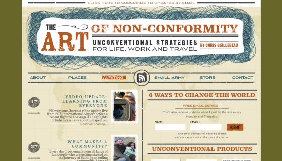
Long ago, before Lizzo was hot, I designed the Art of Non Conformity website (and first edition book cover) for Chris Guillebeau.
I loved that site. I went hog wild with the fonts. I mean, look at this collection of styles:

The Art of Non-Conformity website, circa 2008. The header, navigation and subheaders were all images.
The Art of Non-Conformity website, circa 2008. The header, navigation and subheaders were all images.
But you know what I hated?
They were static.
We were stuck with what I did in the first round.
Every one of those bits of text you see?
Images.
Later on we wrangled some other tech to have slightly more dynamic (changeable) text, but the point is, to give it all that style, I had to make images, and if Chris needed a change, well, I’d be back buried in Photoshop to recut the mockup and make a new image.
I’m kind of exhausted again just thinking about it.
And today, the load time of that site would be ridiculous.
Because of those damn images.
Sexy style, ludicrous load time.
How Google fonts changed the web
Things changed around 2010.
That’s when Google started its free fonts library.
(Other font foundries (the makers of commercial fonts) also launched technology that displays stylized text...without all those images.)
Google fonts gives you flexibility and style at the same time.
Instead of having to make images every time you want the fancier text updated on your website, you simply choose a font face that you like.
Include that on your website with a little bit of code or a Wordpress plugin.
When you change the text on your site, or add a new blog entry or update one of your product descriptions, the text updates automatically and still looks styled.
You can use Google fonts on any text on your website, from your logo to your headlines, to your body copy, to minor accent text… like labels for dates and categories.
Google fonts enables you to have more choices with your content presentation. Just like how programs like Pages, Word and Powerpoint give you font options for stylizing your presentations, Google fonts empowers you to style your website.
Google can host their font files for you and you include them on your site with a Wordpress plugin or small bit of script.
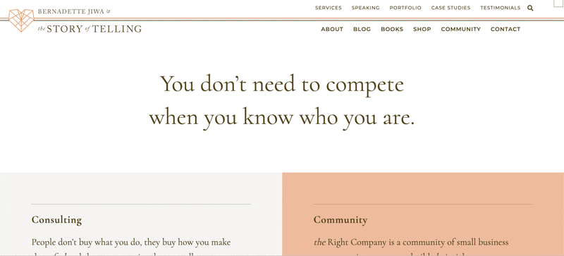
This year I redesigned Bernadette Jiwa’s The Story of Telling using Google fonts (in the prior version of the site we used another commercial foundry).
Here’s a screenshot.
First look at the Google Fonts interface (aka how does this thing work?)
So how do you do this for YOUR website?
Let’s take a look at the Google fonts interface because that's where you’ll spend your font-finding time.
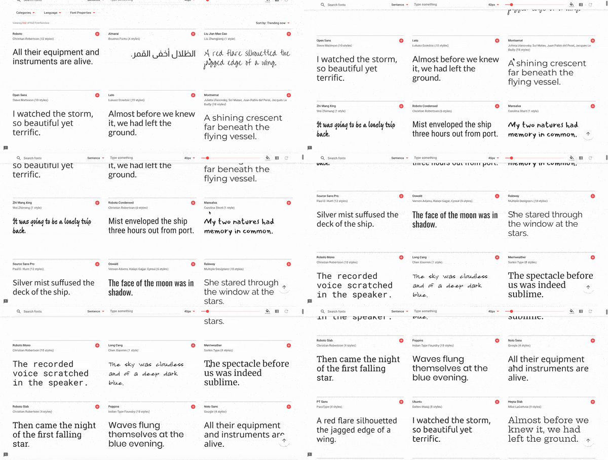
Here’s the opening screen. If you keep scrolling, some 900+ fonts will show up in all their glory (side design tip: don’t implement infinite scrolling on your own website. Just don’t. It’s stressful to anyone except maybe a toddler).
You can type text on the fly and the fonts will update with your example text.
For the body text part of this series, test your text out around 16 pixels, and for headlines, try 40 pixels.
On the far left is a “categories” option, and you’ll use this to narrow down your fonts. Pick one to start: the other lessons break down for you the traits of each category.
The font properties filter gets a bit into the weeds, design wise, so you can ignore it if you care most about getting a font on to your site sooner than later.
Why you should be like the popular kids (sorting Google Fonts)
By default, Google displays fonts sorted by “trending.” I like to sort by “most popular.”
It might seem counterintuitive to choose fonts that everyone else uses, but choosing more popular fonts (especially for your body text) brings a couple benefits:
- The more popular a font is, the more widely it’s used on the internet. This increases the chance that the font file is already in your visitor's browser cache. That’s one less file for them to download when they get to your site.
- Familiarity improves trust. Our subconscious brains store information about things we’ve seen before and get excited like squirrels finding acorns when we see it again.
When something is familiar to us, even at a subconscious level, it can help us feel more comfortable. If we feel more comfortable, we’re more likely to trust the business or website that makes us comfortable.
Familiarity can also help reduce our fatigue: it’s like one less new piece of data our brains have to try and process. This can help ensure that your website visitors keep their focus on your offerings and content.
Your next steps
- Head to fonts.google.com and get to know the interface.
- Input your own text for testing.
- Try to resize text.
- Play around with the filters.
- Get comfy.
Let’s find the hidden money pockets on your website.
Start with this free cheatsheet:
10 Common Website Mistakes That Are Losing You Leads and Sales
(and how to fix them, fast!)


