
6. A Google headline font that sings and dances
and show people your true colors...so they instantly get you.
by Reese Spykerman
This is part of a 10-part series on Google Fonts and how you can use them to make a beautiful website. Visit the series overview here.
To get the most of out of this lesson, you should have a body font selected.
Maybe you already have a body font on your site you’re happy with. Great job! If that’s you, stick with me. This lesson is about choosing a font for your headlines that plays nicely with the body font you chose and signals your brand values and personality.
First, refer back to the list of your brand values & personality you made in lesson 3.
Look again for your overarching theme and use that to help you find a headline font that has personality. (Remember: I’m rooting for personality neutral on your body font, but here with a headline font is where you want to look for a style that asserts its personality more and matches your brand values, personality, and how you want people to feel).
You can look through Google fonts on your own (you can use categories to help you narrow it down. For example, if you know you want a very friendly, casual vibe, the handwriting category is your friend here). Or you can take a shortcut and download my list of headline fonts categorized by personality traits & values.
Before you choose one, you’ll want to keep reading about my formula for mixing two fonts together—so you’ll learn how to choose a headline font that mixes well with the body font you’ve already chosen.
Mixing fonts is an art, and it’s also somewhat subjective, but I’ve got short cuts to make it doable.
Designers develop a feel for font mixing over years of study and practice.
I dug out a project from one of my design courses from years ago, and it was full of red ink. That was when I first learned that a font I really loved wasn’t great for reading (body copy). I also learned I wasn’t mixing my fonts in a very elegant way.
Instead of making you sit through hours of typographic theory like I did, I’m going to give you my simplified formula for mixing your body (reading text) font with a great headline font.
Here’s my mixing fonts formula
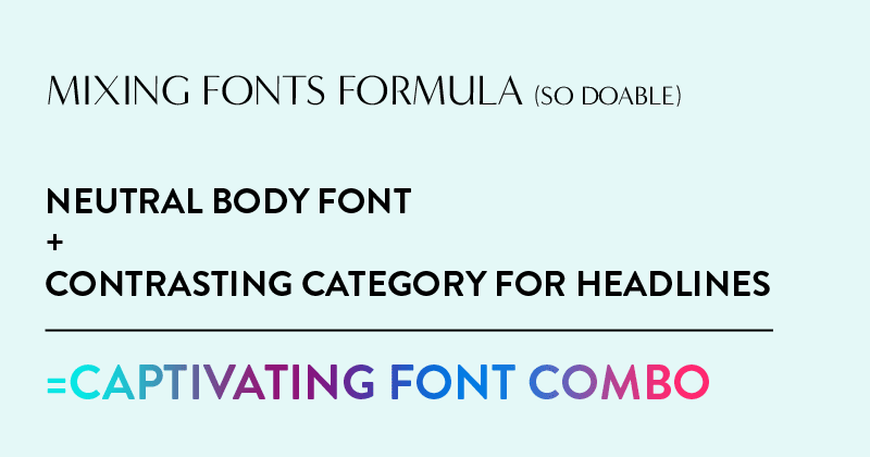
neutral body font
+
contrasting category for headlines
= captivating font combo
Now, let’s break it down:
1. Neutral Body Font
First, and I know this has been on repeat, but it’s really is important: use a neutral font for your body content. (link prior phrase to body copy article) (There’s a free list of my recommended body fonts in the downloads/resources section (link)).
2. Contrasting Category for Headlines
Second, choose a font from a different category (link to categories) than your body font. An earlier lesson covers Google’s font categories, but for a quick reference, that’s
- serif
- sans-serif
- display
- handwriting
- monospace
Here are easy, go-to winning combos:
COMBO A
Body Copy
sans-serif
Headlines
serif
COMBO B
Body Copy
serif
Headlines
sans-serif
COMBO C
Body Copy
sans-serif
Headlines
display
COMBO D
Body Copy
sans-serif
Headlines
handwriting
COMBO D
Body Copy
sans-serif
Headlines
monospace
You might notice a recurring pattern: sans-serif shows up a lot for body text. Here’s why:
- The categories of display, handwriting and monospace are too decorative for use in body copy (we covered in the body copy (link) lesson that more decorative fonts lead to stress and reading fatigue)
- Serif is challenging to mix with another serif. Because they have the serifs (the little feet or decorations on their letter ends), they’re bringing a lot of additional detail to your website as a whole. There’s more potential for them to clash with headline fonts that also have a lot of detail.
Okay, there isn’t a font police who will jail you if you decide to try something else. Experienced designers know how to mix fonts in a different way than I’m suggesting here. But these rules will make things simpler for you and increase the chance that the fonts on your website will look trustworthy, readable and professional.
You might find, after what you’ve learned in this lesson, that you want to reconsider what you choose for a body font. That’s okay. Just remember to keep that body font neutral. Here’s a link to my download on recommended body fonts. (link)
Beware Google’s Suggested Font Pairings
When you go to a font’s individual page, google will give you ideas for suggested or popular pairings.
Sometimes these look lovely, and sometimes they look like a hoarder’s house.
For example, check out what they’ve done here with the font Lato.
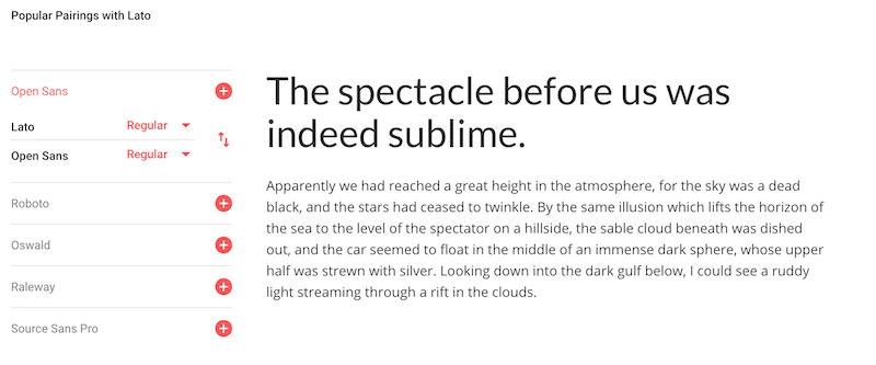
Google suggests pairing Lato with a few different fonts, and a lot of them are sans serif fonts, just like Lato is.
That’s different from my formula for you and you’ll notice a lot of these don’t look bad.
But one issue with using two of the same category together is they can look too samesy. They aren’t different enough from each other, and this can make it harder for your website visitor to easily scan your website and pick out areas they might be interested in exploring further.
What I really want you to see, though, is how problematic some of these fonts can be for reading (body text). See how they’ve suggested Lato with Oswald? If you click this, look at the body text. 😱
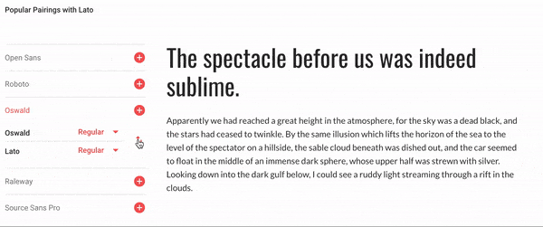
It hurts my eyes to read this. You might think “hey that looks cool,” but anyone who needs to read more than a sentence or two of this is going to tire quickly.
Google’s area with “popular pairings” isn’t always the best guide. Keep that in mind and when they suggest something for the reading font, you can use your common sense and think, “can someone read this comfortably for a long time?”
Great job! Now you know how to mix and match fonts.
Your next steps
Here’s what I want you to do next:
- Review the work you did in lesson 3 (Your brand values & personality).
- Then use your answers to help find a font for your headlines.
- Use the formula (so choose something in a different font category from your body font) and find something a headline font that reflects your brand values and personality.
Let’s find the hidden money pockets on your website.
Start with this free cheatsheet:
10 Common Website Mistakes That Are Losing You Leads and Sales
(and how to fix them, fast!)