
7. Accent text: tiny text that matters
tips for styling small snippets like categories and dates
by Reese Spykerman
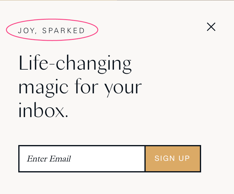 This is a tiny supplementary lesson on accent text. Accent text is what I call the words you have in tiny snippets. Like the text I’ve circled here from Marie Kondo’s website:
This is the text used in small bits, like dates, or the headings of categories.
One easy way to style this text that will look polished is to take your body font, and use it as accent text in Bold, or italics, or all caps. Or you can take your headline font, and use its italic or bold version.
Remember if your headline font is from the “display” category, it won’t look nice at small sizes. This also applies to some handwriting fonts. Use your best judgment, test the font at sizes of 14px-19px and ask “can I still easily read this?”
The accent text is a place where you might also consider using a more decorative font, but if this text is important for navigation—like the breadcrumb navigation of an ecommerce store, a neutral font is a better choice.
Your next steps
- Go through your website and look for possible pieces of “accent text” (dates, categories, tiny headers). Look at the font you chose for your headline, and the font you chose for your body. Which will work best at a small size?
- Then, decide on how you’ll style this text. All caps? Italics? All caps, with some spacing between the letters? A bold version of your body font?
Let’s find the hidden money pockets on your website.
Start with this free cheatsheet:
10 Common Website Mistakes That Are Losing You Leads and Sales
(and how to fix them, fast!)