
4. The personalities of Google fonts
Crazy Uncle Earl and Boujee Cousin Kate: the gang’s all here
by Reese Spykerman
This is part of a 10-part series on Google Fonts and how you can use them to make a beautiful website. Visit the series overview here.
This is where everything gets exciting (to me, at least. The type nerd 🤓).
This lesson is all about the secret lives of fonts. This could be a movie (but only if Samuel Jackson agrees to show up).
Fonts have distinctive personalities.
You might be thinking, “come on, Reese, fonts have personalities? Really?”
Yep, they really do. Some are quiet and formal, and some are loud and assertive. There’s friendly and casual ones, and there’s everything from fonts for hipsters to fonts for bankers.
How does this relate to your business and website? Well let’s say your website is for a retirement home. This rebel-without-a-cause Google font named, appropriately, METAL MANIA, might, MIGHT not be the right personality for that site. Or maybe it is because all the retirees are Gene Simmons fans.

When you know your brand values and brand personality, you will choose fonts that align with them.
When your fonts align with your brand, people trust you more.
Google Font Examples in the Wild
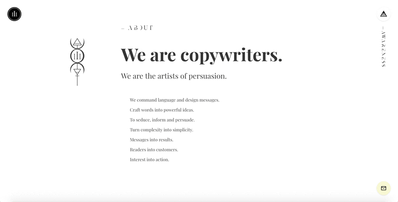
Here’s a website for a copywriting business. Both this font and the website have a formal and sophisticated personality.
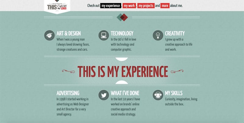
Compare that to this designer’s website. The personality of this font and website is friendly, casual, approachable and confident.
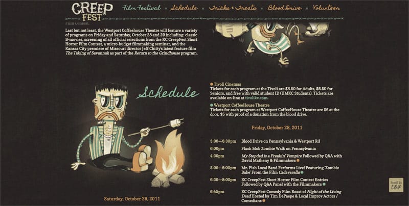
Here’s a zany website with an appropriate font: it’s for a Halloween festival, and this font is so on point for this site.
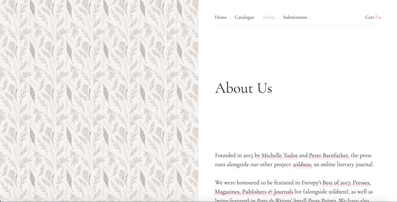
Check out this publisher’s website. See how the fonts are understated, elegant and traditional?
Here’s a landing page for Unicreamer, one of my own client projects that uses Google fonts. This font’s personality is modern, assertive and approachable.

In the font categories lesson, you learned about different font categories, such as serif and sans serif. Right now we’re going to learn more about the personalities of 3 of those categories: serif, sans serif and handwriting fonts.
You learned that generally, serif fonts (again, those are the ones with the little feet, the decorative lines on the ends) have more serious, formal, traditional and conservative personalities.
And you learned sans-serif fonts — those are the ones without the little feet—tend toward minimal, modern, and sometimes youthful personalities.
Handwriting fonts have a casual and friendly vibe. Remember, they might be hard to read, so I don’t recommend them for your body text.
Let’s look at 4 unique Google fonts and compare them with each other so you can see in action the stark differences of the personality of four fonts.
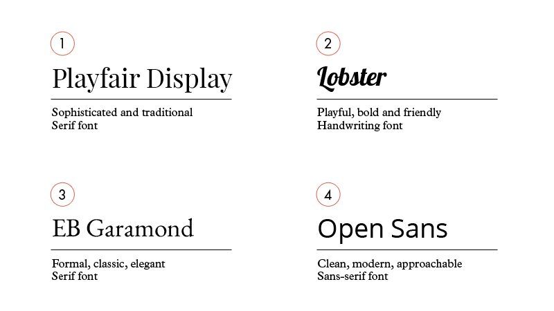
- The first (#1) is Playfair Display, a serif display font.Playfair Display has traits similar to fonts you might see in the fashion industry. Even though it has the traditional aspects of a serif font, there’s some sophistication and modern quirks to this font’s personality, too. If you want a cross between traditional and sophisticated, Playfair is a font to consider for your website.
- Next (#2) is Pacifico. Google categorizes this as a handwriting font. There’s novelty and playfulness to this font’s personality. It’s also pretty confident and bold. If a friendly casual vibe is important to you, Pacifico might fit the bill for your headlines.
- Then there’s #3, EB Garamond, which is a serif font that has that more formal, classic and serious vibe. If high trust, elegance and tradition are qualities you want to convey, EB Garamond is worth a second look.
- Finally, #4 is Open Sans, which is one of the most popular fonts on Google. You’ve probably seen it before, even if you didn’t know its name. This is a sans-serif font that looks very clean, modern and approachable. Open Sans gets straight to the point, but isn’t as bold as some other sans-serif choices. Consider this font if you want to look informal yet trustworthy—straightforward but not extremely bold and loud.
Those are just four of the hundreds of Google fonts, and now you can see what a big difference a font can make when you want to customize the personality of your website.
Your next steps
If you’re still a bit overwhelmed on choosing the best fonts for your website, it’s okay.
Instead of worrying about that decision yet, just take 10-15 minutes to familiarize yourself with the variety of Google fonts.
Go to fonts.google.com, sort by “most popular” and scroll down for a bit. Look at 5-8 different fonts.
See if you can identify each font’s category and ask yourself “What is this font’s personality?” Does it seem bold to you? Quiet? Refined? Charismatic? Assertive? Neutral, like Sweden?
By just taking a few minutes to analyze fonts, label their categories and identify how you see the personality traits of those fonts, you’ll become comfortable with fonts. You’ll be more empowered when it comes time to decide what works best for your business and brand.
Let’s find the hidden money pockets on your website.
Start with this free cheatsheet:
10 Common Website Mistakes That Are Losing You Leads and Sales
(and how to fix them, fast!)